Wednesday, July 21, 2010

AHMAGADD. (Emma Summerton)

AHMAGADD. I would estimate I spend maybe 70% of my time looking for editorials (so thrilling, except that it actually is for me) and ranting on about the lighting and how some models JUST WON'T CONNECT WITH ME. Rah rah rah (I'm so Gaga right HAHARIGHT).

Somewhere in between all of this I've found a complete myriad of wonderful photographers who I want to follow around all day like that dog in Up. And exactly that creepy. I will probably post all my favourite editorials from time to time but I just wanted to do this one about Emma Summerton (BECAUSE I LOVE HER. RIGHT.)
SO YAH.


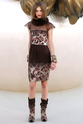
'Neo-Romantic': Imogen Morris Clarke and Abbey Lee Kershaw photographed by Emma Summerton for Vogue Italia June 2009

Firstly: OH GOD I can't even begin to talk about Abbey Lee in platinum blonde. AND THE JEWELRY. In the second picture (you might have to click-through to make it bigger) Imogen is wearing this amazing Fendi ring-bracelet AND THAT CAVALLI ARM BRACELET (ARE YOU SEEING THIS? WHY AM I THE ONLY ONE YELLING?)

And the Balenciaga dress Abbey is wearing in the eighth image. Mostly I get ridiculously excited about the details, i.e. the blue wallpaper, the bed header? (That's wrong. WHAT IS THAT WORD), the lipstick colours, the jewelry (DUH), the phone (second picture) and the mix of colours all together.


Secondly: I feel like I should explain something about Neo-Romanticism, because I love it and will probably mention it a lot, and also BECAUSE OF IT'S AWESOMENESS.

Basically it's a revival of Romanticism (mid 18th century counter-movement against the Age of Enlightenment). Should I explain what the Age of Enlightentment is? (UM ONLY THE GREATEST TIME FOR DEMOCRACY, EVER.)

The Enlightenment movement focused on deductive reasoning and logic (really important in politics, not so much in art); it was within the Age of Enlightenment that the Declaration of the Rights of Man and Citizen (i.e. the beginning of democracy) was written. Everyone was having a mad time revolutionising the governments (American revolution, French revolution, Haitian Revolution - Oh check 'Atlantic Revolutions') and started creating a more fairer government for everyone, replacing the autocracies, monarchies etc etc etc etc.

In the middle of (THE GREATEST CENTURY ON EARTH. I mean, come on, Voltaire) all this sprung Romanticism, inspired by feelings. Oh dandy. Romantic art looks at intuition, irrationality and imagination; it's like a painting of someone diving off a cliff - Romantics don't paint what they see (contrary to Realism), they paint what they feel (you can see how 'romantic' comes into it). Like how sometimes I think my head is a burning house. A Romantic painter paints from the imagination instead of recalling scenes or sitting in front of a bowl of fruit.

I should probably mention how dark it is/can be. A lot of Romanticism romanticizes (don’t try to say that out loud) evil - like the beauty of a storm. Frankenstein is a really good example of this. If you’ve ever read it, it’s eerie and creepy, but you can see the beauty and wonder. Essentially it's a clash/mix of the gold, cream, white, pastels of Louis XV age against the deep purples, blues and blacks of the Gothic age.

(OH LOOK I did some links to the outfits for you guys! Why do I do this to myself? I just have to know, ya know?)
Cover: Nina Ricci dress and jacket, Comme des Garcons dress (I can't work out which exact one, so that's just the line); 2: Roberto Cavalli dress; 3: Dolce and Gabbana jacket/suit (I can't seem to find it anywhere but it's similar to the click through)  Alexander McQueen and Swarvoski body suit; 5: Moncler Gamme Rouge (collection by Giambattista Valli) bomber jacket; 6: Chanel dress; 7: Giles hood and dress; 8: Balenciaga dress, Moncler Gamme Rouge (collection by Giambattista Valli) jacket and short; 9: Rodarte dress


'The Now: Mix n Match': Lily Donaldson and Gemma Ward photographed by Emma Summerton for Vogue Italia, May 2008

The best thing about Emma's shoots is that they tend to have this really awesome lighting that brings out the clothes. I'm not sure how she works that out. The concept of this one is what I really love about it though; everyone (not everyone, but some people) love/s seeing models in their natural habitat, which is what the editorial is sort of going for (in my opinion anyway). I'm just imagining Lily and Gemma going on some shoot a thousand miles away and staying at dumpy motels along the way.

And I love how they hold their cigarettes. I don't even know what it is. Probably because they're so skinny. Other than that, I do feel a bit weird looking at old Gemma shoots. But not too weird.


'Bohemian Way': Sasha Pivovarova photographed by Emma Summerton for Vogue Italia, February 2010

YES. So Emma's like 'Oh I've been so delicate and precise with colours, maybe I'll just shove it in their faces' AND BAM. I think it really works. All photography is like food (sometimes Meisel's food is just crockery.. WHAT STEVEN WHAT. YOU'VE CHANGED) and the best type is that that reaches through the piece of paper or screen and reaches into your stomach and yanks it out. (I probably should have said heart and not stomach, but whatever). My point is, this is like really good Indian food. A whole banquet, even.

I feel like colour is exploding in my face and I can't see everything. And I just want to be here amongst piles of rugs and curtains and art, in this amazing styling (John Galliano shoes) (Oh and the orange dress that's slung over one knee - UM, MAGIC, YES) and have my hair cut in a short red bob. It might not look as good as on Sasha though..

The lighting is so dense as well! It's very Tungsten, but with no real spots of colour, just masses of it coming to eat my face.


'Red Alert': Hannah H, Heleen S, Ilvie W, Ylonka V, Anastasija K and Helena S photographed by Emma Summerton for UK Vogue, 2009

This is a hugely long post. And this is a hugely long editorial and I don't even care (actually I did take out two photos..). Anyway, RED ALERT. Ahemhem. This could not be anymore aesthetically delicious. I am so in love with these foregrounded (oo-la-la) red outfits against the blue/grey and white. And I love how the rocks are really similar in shade to the models' skin colour (I don't know if Emma did that or if it just happened) so that it's really only three elements, which is making it really really dimensional. I could actually go on about this one all day.

But I probably shouldn't.

I should probably stop blogging and resume raging away to Lydia (AWESOME SINGER/BAND I FOUND. Yeah I do that a bit. What of it? It's actually not really the raging type singer/band. Annyyyway..). Farewell!

Monday, July 19, 2010

Playing (is it playing?) with my dELiRiuM

You have to use that half capitalisation because that's how she sings it.
UGH I am so lazy with this blog. I was half way through posting about Fall Couture when I couldn't decide what to write about Chanel (I HAVE A LOT OF FEELINGS) and then kind of stopped.
Obviously a mad panic attack is now ensuing because it's been weeks and I haven't posted the Fall Couture lines. Or the Resort lines! Oh lord don't get me started on the Resort lines.

Anyway, it's 7.30 in the morning and I haven't slept all night so I'm reaching this weird state where my brain is in so much pandemonium it's gone into limbo. I'm just assuming this is what's going on because the washing machine has started next to my room and it's getting increasingly difficult to stop my brain from melting.

HERE ARE SOME COLLECTIONS:


Maybe I'm just hugely ignorant or have early on-set amnesia (does this exist?) but I have never heard of Alexis Mabille. I did a little delving (so as not to seem as silly as I obviously am) and discovered the French designer has worked with Nina Ricci, Ungaro and John Galliano after recieving his diploma a year early (in 1997). And he is most renowned for his bow ties! (Oo la-la).

This line is so incredible because it is made up, for the most part, of those pieces you can dress up or dress down, which is exactly Alexis' point. I think the official term for it is 'versatility'.You get the idea when you look at the whole line and notice how certain pieces reappear (i.e. the jacket in images 1 and 3) - THIS IS NOT BECAUSE HE RAN OUT OF CLOTHES. Or it could be and this could be an awesome cover.  Anyway, you should check it out.

Oh and also, you  might be familiar with his Spring Couture line.


I am Karl the Great and for my next trick I will JUST HAVE A REALLY BIG GOLD LION. NO TRICK IT'S JUST AWESOME. Oh, Chanel. You know I adore you. But I couldn't get in to this one. Chanel is so wonderfully created and technically a total masterpiece, that when it comes to couture lines it's a lot harder to make a distinction between what is ready to wear and what is couture.

Maybe it was because I didn't like the shoes. I loved the palette, and I'm not just running in fright because Karl didn't turn out any long dresses this collection, I just generally thought it was pretty toned down for couture. It probably needed more jewelry. Even the hair was very ready to wear (Oh dear that rhymed. What to do whattodoooo). Anyway, you may kill me now. (I want to say You may feed me to the lions, but I just can't be that corny).


Oh hello, didn't I see a movie to do with this? NOPE, BECAUSE NOTHING THIS BEAUTIFUL HAS EVER HAPPENED IN REAL LIFE. (I really set myself up for that firecracker!). Ahhh Christian Dior. You have to sigh when you mention anything to do with John Galliano, in that - oh it's so wonderful and lovely and amazing and dreamy - sigh.

It took so much self restraint not to post this whole collection, and only enough so you get the image of a flower blooming. You got that, right? This is one of the few collections I've seen that I didn't have to read a review to get the theme. Mostly I just make up the themes myself though, because you know, art is what you make of it.

Apparently Galliano studied flowers for ages just to pull this together. Not that I'm surprised. I am surprised that it's for Fall though, it would be so perfect for Spring! I really need to talk about the materials (which I am pretty sure include every material under the sun, with the exception of corduroy, of course) and the colours which were so, just, vivid and how the simplest idea can inspire total masterpieces. And the hair pieces! But I would be gobsmacked if anyone read a post this long.

No matter though. It would have been the stand out of the day in my opinion, if it hadn't been for Givenchy. Ahh Givenchy.


I'll never understand why people believe in Jesus when real life gods like Riccardo Tisci exist. This Givency collection is pretty much everything I image when I think of utter and complete beauty. Who could deny this, honestly? I don't even know where to begin because I'm re-entering shock and forgetting how to type.

Chantilly lace, ostrich feathers, fringing and baboon fur. OH and the ornaments! Each of these pieces is a total work of art. 98% chance I would faint if I ever touched one. NO. 99%. The colours are so light, but you get a really heavy Gothic feel I think - if it did have stains of dark I would definitely be calling this Neo Romantic. I will probably call it that anyway. It has this underlying tone of armor - especially around the middle - as well as this haunting density (you could hardly call it light) laced in between Romantic prints and the falling silk.

It's that mix of hard and soft to create something really beautiful. Wow. Just wow.


I don't want to call it a mess. This collection has been picked apart a bit because of Jean Paul Gaultier's inability to live up to previous expectations. This seems to work out well for me because I never really loved Gaultier, so my expectations were never that high. I don't know how the 1920s doesn't come to mind for a lot of fashion journalists. I mean, feather in a hat, that shiny prom dress material (the name escapes me now, I know it's ghastly), how are you not envisioning long cigarette holders and the earliest days of Coco Chanel?

I guess what I really got from it was that element of ritz. I want to think of a word that is less kitch, but I just can't force myself to say luxurious. It was hard to tie these elements together. I guess this is because - as has been pointed out to me - the collection was more of a reference to Jean Paul himself then a real theme. That's awesome, but it also makes it a total nightmare. How one can even begin to illustrate the many layers of a person; on any given day my style can change about five times (maybe subtly, but still), not to mention my mood.

What I will say I loved about the collection was the styling. The outfit JStam is wearing in the third image made me rethink the entire line. And most of the outfits individually I would love to see in an editorial, but here, they just didn't piece together well enough.


I have to talk about Valentino, just because of how much I disliked it. I was pretty passive about Armani, Bouchra and Saab, so I didn't bother mentioning them, but I don't think I can go past this. Firstly, puppy dogs. I can't stop thinking about puppy dogs when I look at the huge fur cuffs on the first dress (I'm thinking a poodle) or the array of bows on the third dress (Maltese Schitzu?).

Moreover, who is this line being pitched to? The bird cage (Image four) is obviously some sort of Gaga exclusive, and the rest of the dresses have this weird semi-formal feeling. Maybe I'm just bitter because McQueen did a (notably better) version of the cage pattern in his Spring 2007 line.


So that's it - the five week late run down of the Fall shows. Should I say better late than never?